Yeah, I went and looked at those. I never realized that the Denver logo was that "interesting" back in the day.

I have some ideas for you. I like jerseys that look realistic when compared with what they represent.
Heat: check this site out
http://en.wikipedia.org/wiki/Flame. If you notice the hottest flame is actually blue! Red is actually the coolest flame because it is starved for oxygen. I wonder if a light blue, purple and orange jersey would work for the heat.
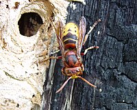
Hornets: I understand why the Hornets were using teal in North Carolina. Never understood why they stuck with that color when they moved.
If someone were to go with the colors of the indigenous hornets one would go with the bald faced hornet. Black with white trim. (Black is purplish when viewed in some lights.)
-R.jpg)
If someone were to go with the invasive species of hornet that has taken over the southeast one would go with the European hornet. Red, Yellow, and Black.
Dynasty: Puttins Bobcats yr1 http://manfrednba2k11bobcatdynasty.blogspot.com/taking draft applications!
2010-11 Playoffs - Cats beat Celtics in 5!

“All truth passes through three stages. First, it is ridiculed. Second, it is violently opposed. Third, it is accepted as being self-evident.”
Arthur Schopenhauer- German philosopher (1788 - 1860)