
This year's playoff logo...
22 posts
• Page 1 of 1
This year's playoff logo...
![]() by Colin on Sun Apr 24, 2005 3:37 pm
by Colin on Sun Apr 24, 2005 3:37 pm
I assume you all noticed the playoffs logo on all the courts today. Why is it so simple and ugly? They usually try to style it up. And this year it's pretty big, distracted me a lot. But maybe I just have ADD, or it's hyperavtive cousin, ADHD. (Anybody seen that episode of Clone High? No? Never heard of the show? Oh well)
C#

Pretty Flaco
Pretty Flaco
-

Colin - Posts: 5913
- Joined: Thu Mar 06, 2003 7:02 am
- Location: Van-City
![]() by cyanide on Sun Apr 24, 2005 3:56 pm
by cyanide on Sun Apr 24, 2005 3:56 pm
"Destination Finals" ?? Not sure if you're referring to that, but "Destination Finals" is ugly and uninspiring. The blue red and grey sucks.
if you were killed tomorrow, i WOULDNT GO 2 UR FUNERAL CUZ ID B N JAIL 4 KILLIN THE MOTHA FUCKER THAT KILLED U!
......|..___________________, ,
....../ `---______----|]
...../==o;;;;;;;;______.:/
.....), ---.(_(__) /
....// (..) ), ----"
...//___//
..//___//
.//___//
WE TRUE HOMIES
WE RIDE TOGETHER
WE DIE TOGETHER
......|..___________________, ,
....../ `---______----|]
...../==o;;;;;;;;______.:/
.....), ---.(_(__) /
....// (..) ), ----"
...//___//
..//___//
.//___//
WE TRUE HOMIES
WE RIDE TOGETHER
WE DIE TOGETHER
-

cyanide - Dat steatopygous
- Posts: 9197
- Joined: Sat Oct 11, 2003 6:09 am
- Location: US's toque


![]() by cyanide on Sun Apr 24, 2005 4:45 pm
by cyanide on Sun Apr 24, 2005 4:45 pm
That's uninspiring too  I don't know why they went for the big dull look this year
Thanks for finding the image, Colin
Thanks for finding the image, Colin
if you were killed tomorrow, i WOULDNT GO 2 UR FUNERAL CUZ ID B N JAIL 4 KILLIN THE MOTHA FUCKER THAT KILLED U!
......|..___________________, ,
....../ `---______----|]
...../==o;;;;;;;;______.:/
.....), ---.(_(__) /
....// (..) ), ----"
...//___//
..//___//
.//___//
WE TRUE HOMIES
WE RIDE TOGETHER
WE DIE TOGETHER
......|..___________________, ,
....../ `---______----|]
...../==o;;;;;;;;______.:/
.....), ---.(_(__) /
....// (..) ), ----"
...//___//
..//___//
.//___//
WE TRUE HOMIES
WE RIDE TOGETHER
WE DIE TOGETHER
-
cyanide - Dat steatopygous
- Posts: 9197
- Joined: Sat Oct 11, 2003 6:09 am
- Location: US's toque
![]() by Andrew on Sun Apr 24, 2005 4:50 pm
by Andrew on Sun Apr 24, 2005 4:50 pm
They've been doing that the last couple of years; they haven't been using the classic East/West logos as much, opting for plainer, text-based logos.
Contact: Email | X | Bluesky
Modding Topics: NBA 2K10 | NBA Live 08 | NBA Live 07 | NBA Live 06 | NBA 2K6 | NBA Live 2005 | NBA Live 2004 | NBA Live 96
Story Topics: NBA Live 16 | NBA 2K14 | NBA 2K13 | NBA Live 06 (Part 2) | NBA Live 06 (HOF) | NBA Live 2004 (HOF)
NLSC: Podcast | The Friday Five | Monday Tip-Off | Wayback Wednesday | Facebook | X | YouTube | Instagram | Bluesky
Donations/Support: Patreon | PayPal
-
Andrew - Retro Basketball Gamer

- Posts: 115322
- Joined: Thu Aug 22, 2002 8:51 pm
- Location: Australia
![]() by COOLmac© on Mon Apr 25, 2005 11:07 am
by COOLmac© on Mon Apr 25, 2005 11:07 am
no stern is saving a lot this year.....since they are into the NBDL.....that one is millions spent too.

MY FORUMS [u pinoy? go here!]/YES COOLmac's WHITEmen DYNASTY!!!
coolmac's weekly random lyrics #23 I'm dumb she's a lesbian. i thought i have found the one
coolmac's law of plain logical events #479 use common sense, you need to sleep to live
-

COOLmac© - Posts: 3710
- Joined: Wed Feb 09, 2005 1:48 pm
- Location: NCR phil..>",<


![]() by air gordon on Mon Apr 25, 2005 3:25 pm
by air gordon on Mon Apr 25, 2005 3:25 pm
looks like the "sports authority" sign to me 
Jump.
Scott Skiles answer to the question on how Eddy Curry can become a better rebounder
Scott Skiles answer to the question on how Eddy Curry can become a better rebounder
-

air gordon - Posts: 7867
- Joined: Wed Nov 13, 2002 4:06 pm
- Location: windy city


![]() by COOLmac© on Wed Apr 27, 2005 12:49 pm
by COOLmac© on Wed Apr 27, 2005 12:49 pm
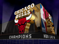
how about the logo in nba live 2005.looks cool to me
MY FORUMS [u pinoy? go here!]/YES COOLmac's WHITEmen DYNASTY!!!
coolmac's weekly random lyrics #23 I'm dumb she's a lesbian. i thought i have found the one
coolmac's law of plain logical events #479 use common sense, you need to sleep to live
-
COOLmac© - Posts: 3710
- Joined: Wed Feb 09, 2005 1:48 pm
- Location: NCR phil..>",<

![]() by COOLmac© on Mon May 02, 2005 7:02 pm
by COOLmac© on Mon May 02, 2005 7:02 pm
correct.they have become transparent 
MY FORUMS [u pinoy? go here!]/YES COOLmac's WHITEmen DYNASTY!!!
coolmac's weekly random lyrics #23 I'm dumb she's a lesbian. i thought i have found the one
coolmac's law of plain logical events #479 use common sense, you need to sleep to live
-
COOLmac© - Posts: 3710
- Joined: Wed Feb 09, 2005 1:48 pm
- Location: NCR phil..>",<
22 posts
• Page 1 of 1
Who is online
Users browsing this forum: No registered users and 10 guests