
Hideous. I don't like how more and more teams go for the generic look.
Clean is one thing, generic is just ughh.
New logos, designs, etc.
115 posts
• Page 5 of 5 • 1, 2, 3, 4, 5
Re: New logos, designs, etc.
![]() by Mandich on Mon Dec 22, 2014 2:27 am
by Mandich on Mon Dec 22, 2014 2:27 am
-

Mandich - Muffin Button
- Posts: 2222
- Joined: Sun Mar 02, 2008 9:22 pm
- Location: Croatia
Re: New logos, designs, etc.
![]() by [Q] on Mon Dec 22, 2014 3:21 am
by [Q] on Mon Dec 22, 2014 3:21 am
Andrew wrote:It's a bit plain, but it's alright. A bit too similar to Brooklyn's logo, if anything.
Am I to take it that there's regret over the "Raptors" moniker, given that they're phasing out the dinosaur? I mean, I realise it's kind of a throwback to the mid-90s, when the first Jurassic Park was a big thing and dinosaurs were more prominent in pop culture, which in retrospect may not have been the best influence for a new expansion team that was entering the league in a couple of year's time. Still, they are the Raptors, so it's not like a dinosaur logo or mascot is out of place.
pretty sure they've been embarrassed by the red cartoon dinosaur in their logo for quite some time

-
[Q] - NBA Live 18 Advocate

- Posts: 14396
- Joined: Tue Oct 01, 2002 8:20 am
- Location: Westside, the best side
Re: New logos, designs, etc.
![]() by Andrew on Mon Dec 22, 2014 8:35 am
by Andrew on Mon Dec 22, 2014 8:35 am
Presumably so, but like I said, they are the Raptors. It's not like it's a terrible design. The new one is fine enough, but it's a bit generic and very similar to Brooklyn.
Contact: Email | X | Bluesky
Modding Topics: NBA 2K10 | NBA Live 08 | NBA Live 07 | NBA Live 06 | NBA 2K6 | NBA Live 2005 | NBA Live 2004 | NBA Live 96
Story Topics: NBA Live 16 | NBA 2K14 | NBA 2K13 | NBA Live 06 (Part 2) | NBA Live 06 (HOF) | NBA Live 2004 (HOF)
NLSC: Podcast | The Friday Five | Monday Tip-Off | Wayback Wednesday | Facebook | X | YouTube | Instagram | Bluesky
Donations/Support: Patreon | PayPal
-
Andrew - Retro Basketball Gamer

- Posts: 115384
- Joined: Thu Aug 22, 2002 8:51 pm
- Location: Australia
Re: New logos, designs, etc.
![]() by Alpha_ on Mon Dec 22, 2014 9:48 am
by Alpha_ on Mon Dec 22, 2014 9:48 am
Andrew wrote:Presumably so, but like I said, they are the Raptors. It's not like it's a terrible design. The new one is fine enough, but it's a bit generic and very similar to Brooklyn.
Agree.
Brooklyn's logo is the worst. It's too generic. F*ck Jay-Z lol.
-

Alpha_ - Night Knight
- Posts: 4818
- Joined: Sun Sep 28, 2008 12:31 am
- Location: Manila, Philippines
Re: New logos, designs, etc.
![]() by JAWSFreelao on Tue Dec 23, 2014 1:18 am
by JAWSFreelao on Tue Dec 23, 2014 1:18 am
The brownish one is for Drake Night, to represent OVO.
Because that's what Drizzy does apparently.
Because that's what Drizzy does apparently.
Been on the thinnest of ice and I turned myself into Gretzky.
2K13-2K20 modder.
CFs are the game.
Primary modder for NBA 2K14 D-League conversion mod.
2K13-2K20 modder.
CFs are the game.
Primary modder for NBA 2K14 D-League conversion mod.
-
JAWSFreelao - Posts: 1051
- Joined: Thu Mar 27, 2014 1:07 pm
Re: New logos, designs, etc.
![]() by benji on Sat Dec 27, 2014 11:44 pm
by benji on Sat Dec 27, 2014 11:44 pm
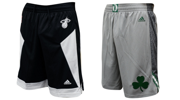
Some of the sleeved jerseys would look really nice if they weren't sleeved ones. Like the silver Magic ones.
-

benji - Posts: 14545
- Joined: Sat Nov 16, 2002 9:09 am
Re: New logos, designs, etc.
![]() by [Q] on Sat Jan 24, 2015 6:55 pm
by [Q] on Sat Jan 24, 2015 6:55 pm
A look at the Nets alternate
It's essentially their current jersey with "NETS" instead of "BROOKLYN" and they took the stars and stripes and put it down one side of the jersey
Heat wore their "Black tie" jerseys today. Looked a bit different from their norm, but it's not their best alternate they've ever had
It's essentially their current jersey with "NETS" instead of "BROOKLYN" and they took the stars and stripes and put it down one side of the jersey
Heat wore their "Black tie" jerseys today. Looked a bit different from their norm, but it's not their best alternate they've ever had
-
[Q] - NBA Live 18 Advocate
- Posts: 14396
- Joined: Tue Oct 01, 2002 8:20 am
- Location: Westside, the best side
Re: New logos, designs, etc.
![]() by Murat on Sun Feb 08, 2015 6:03 am
by Murat on Sun Feb 08, 2015 6:03 am

http://www.nba.com/rockets/news/chinese ... r-uniforms

http://www.nba.com/warriors/news/chines ... s-20160126
I liked Rockets design for Chinese New Year. But the first ever red colored uniform of Warriors doesn't look nice.

- Murat
- The modder formerly known as Badger

- Posts: 6489
- Joined: Sun Feb 14, 2010 6:07 am
- Location: US/East Coast
Re: New logos, designs, etc.
![]() by JAWSFreelao on Sun Feb 08, 2015 8:11 am
by JAWSFreelao on Sun Feb 08, 2015 8:11 am
The Rockets design is better, but the Warriors look nice even though the red makes me want to punch orphans.
Been on the thinnest of ice and I turned myself into Gretzky.
2K13-2K20 modder.
CFs are the game.
Primary modder for NBA 2K14 D-League conversion mod.
2K13-2K20 modder.
CFs are the game.
Primary modder for NBA 2K14 D-League conversion mod.
-
JAWSFreelao - Posts: 1051
- Joined: Thu Mar 27, 2014 1:07 pm
Re: New logos, designs, etc.
![]() by Andrew on Sun Feb 08, 2015 9:37 am
by Andrew on Sun Feb 08, 2015 9:37 am
Would be great as fan apparel, don't care for it as an official uniform. Par for the course with sleeved jerseys.
Contact: Email | X | Bluesky
Modding Topics: NBA 2K10 | NBA Live 08 | NBA Live 07 | NBA Live 06 | NBA 2K6 | NBA Live 2005 | NBA Live 2004 | NBA Live 96
Story Topics: NBA Live 16 | NBA 2K14 | NBA 2K13 | NBA Live 06 (Part 2) | NBA Live 06 (HOF) | NBA Live 2004 (HOF)
NLSC: Podcast | The Friday Five | Monday Tip-Off | Wayback Wednesday | Facebook | X | YouTube | Instagram | Bluesky
Donations/Support: Patreon | PayPal
-
Andrew - Retro Basketball Gamer
- Posts: 115384
- Joined: Thu Aug 22, 2002 8:51 pm
- Location: Australia
Re: New logos, designs, etc.
![]() by [Q] on Fri Jul 24, 2015 10:58 am
by [Q] on Fri Jul 24, 2015 10:58 am
A shit ton of uniform leaks.
Everything under "Alternate Uniforms" is fugly.
More Pride uniforms, some of which are awful.
Wizards Pride is a bit of a throwback which is cool.
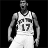
Finally some cool Knicks throwbacks!
Warriors will wear the popular "The City" jerseys this year.

Everything under "Alternate Uniforms" is fugly.
More Pride uniforms, some of which are awful.
Wizards Pride is a bit of a throwback which is cool.
Finally some cool Knicks throwbacks!
Warriors will wear the popular "The City" jerseys this year.
-
[Q] - NBA Live 18 Advocate
- Posts: 14396
- Joined: Tue Oct 01, 2002 8:20 am
- Location: Westside, the best side
Re: New logos, designs, etc.
![]() by Andrew on Fri Jul 24, 2015 11:17 am
by Andrew on Fri Jul 24, 2015 11:17 am
Yeah, I'm just going to bookmark that image for the next time the claim is made that the 90s had the ugliest uniforms.
Contact: Email | X | Bluesky
Modding Topics: NBA 2K10 | NBA Live 08 | NBA Live 07 | NBA Live 06 | NBA 2K6 | NBA Live 2005 | NBA Live 2004 | NBA Live 96
Story Topics: NBA Live 16 | NBA 2K14 | NBA 2K13 | NBA Live 06 (Part 2) | NBA Live 06 (HOF) | NBA Live 2004 (HOF)
NLSC: Podcast | The Friday Five | Monday Tip-Off | Wayback Wednesday | Facebook | X | YouTube | Instagram | Bluesky
Donations/Support: Patreon | PayPal
-
Andrew - Retro Basketball Gamer
- Posts: 115384
- Joined: Thu Aug 22, 2002 8:51 pm
- Location: Australia
Re: New logos, designs, etc.
![]() by debiler on Sun Jul 26, 2015 7:18 pm
by debiler on Sun Jul 26, 2015 7:18 pm
Andrew wrote:Yeah, I'm just going to bookmark that image for the next time the claim is made that the 90s had the ugliest uniforms.
Yeah. In the 90's, at least they TRIED to do something with the teams' identities. Now it's just swapping the colors.
Confucius say: "Man go to bed with itchy butt wake up with smelly finger."
-

debiler - Posts: 1016
- Joined: Wed Nov 13, 2002 8:35 am
- Location: Stuttgart, Germany
Re: New logos, designs, etc.
![]() by Murat on Mon Jul 27, 2015 12:45 am
by Murat on Mon Jul 27, 2015 12:45 am
I mostly agree with [Q]
Repeated throwbacks are boring!
Bucks and Hawks new identities are interesting.
Repeated throwbacks are boring!
Bucks and Hawks new identities are interesting.
- Murat
- The modder formerly known as Badger
- Posts: 6489
- Joined: Sun Feb 14, 2010 6:07 am
- Location: US/East Coast
Re: New logos, designs, etc.
![]() by mp3 on Mon Jul 27, 2015 1:51 am
by mp3 on Mon Jul 27, 2015 1:51 am
I like the new (old) knicks throwback jersey, anything is better than the Orange jerseys we have!
Youtube - mp3 Basketball Gaming
-

mp3 - Posts: 5435
- Joined: Mon Feb 24, 2003 12:45 am
115 posts
• Page 5 of 5 • 1, 2, 3, 4, 5
Who is online
Users browsing this forum: No registered users and 21 guests