A few more quick things m@rcus:
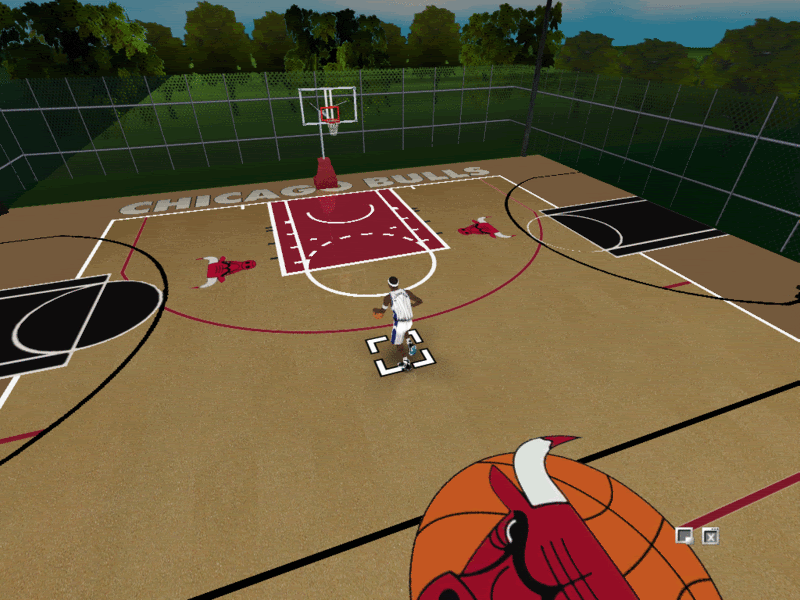
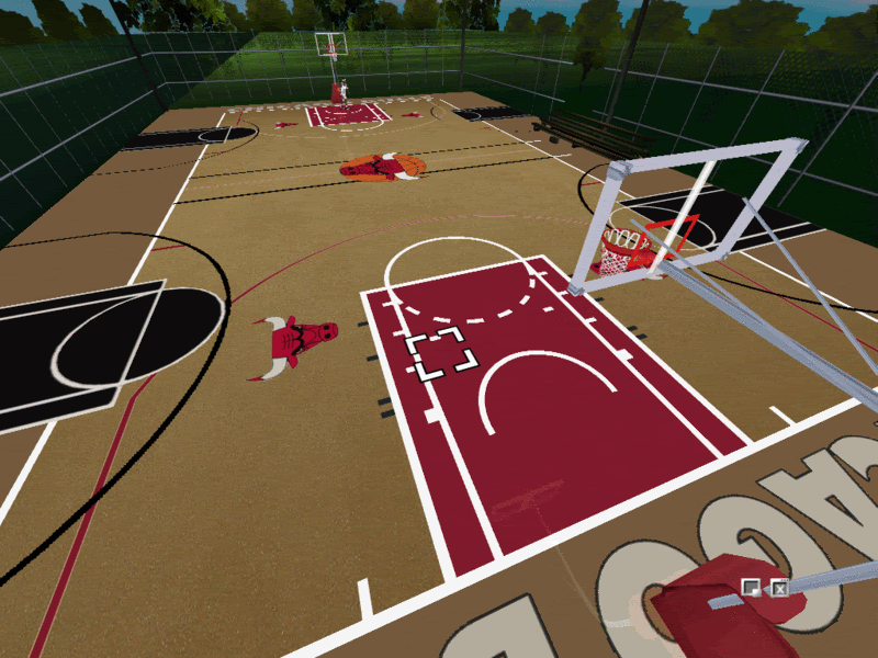
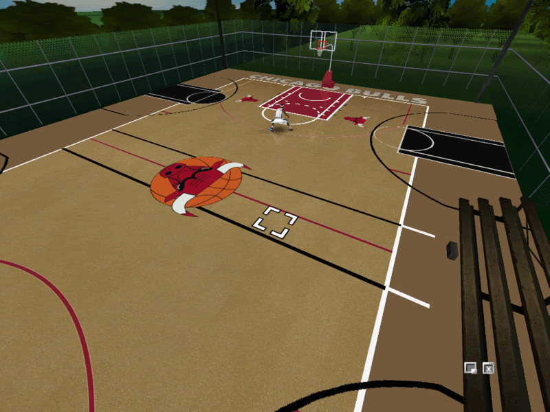
Make the whole environment a bit more narrow. In the Street version, the side 3-point arcs are pushing right up against the Bulls logos -- they are not meant to be full sized regulation courts, but smaller ones that are side by side. Also, your fence is far too high and you need to add the dark black stripe around the main court, with proper baseline wordmarkings.
Not trying to be critical here. This looks great now, but will be incredible if you make it closer to the original image. Keep up the great work.