Hawks new unis
Sun Jun 24, 2007 7:26 am

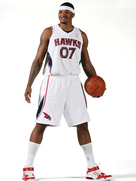

I don't like it very much. Too bland and the logo on the shorts looks like the Arizona Cardinals.

Sun Jun 24, 2007 7:34 am
Perhaps the Cardinals since 1985 are their idols in terms of building a good team...
I think it looks less like their logo than it does like the logo of how many "Falcons/Hawks/Eagles/etc." in college basketball.
I think it looks less like their logo than it does like the logo of how many "Falcons/Hawks/Eagles/etc." in college basketball.
Last edited by benji on Sun Jun 24, 2007 7:35 am, edited 1 time in total.
Sun Jun 24, 2007 7:35 am
Wow. That came out of nowhere!?
They make me think of Team USA. The color schemes and the designs on the sides look similar.
I don't know. They are pretty much completely opposite to last years jerseys, they look nice, but they don't look right. If it was an expansion team coming in and using these uni's I would think they would look good, but it's so far from the classic Hawks look that they look weird.
EDIT: "07" is ugly on any jersey, so I think they will look alot nice with a simple number.
Last edited by --- on Sun Jun 24, 2007 7:45 am, edited 1 time in total.
Sun Jun 24, 2007 7:43 am
Yeah i also thought of Team USA right away. I think they look better, plus the NBA needed a "red road team" to change to another color. I dont really like the Number font though.
Last edited by -Young Buck- on Sun Jun 24, 2007 7:49 am, edited 1 time in total.
Sun Jun 24, 2007 7:44 am
I don't like them! They look so...  ! I liked their old jerseys better! 11987 ones!
http://www.anacondasports.com/wcsstore/ ... 7r_med.jpg
http://www.anacondasports.com/wcsstore/ ... 7r_med.jpg
Sun Jun 24, 2007 7:47 am
They're too...new school.
All the teams seem to be adapting this "style" of jerseys.
All the teams seem to be adapting this "style" of jerseys.
Sun Jun 24, 2007 8:14 am
those look like shit!
Sun Jun 24, 2007 8:18 am
A little odd. The coloring scheme and the font is a bit weird. I welcome a new change since I didn't really like their old one. but the color scheme and the the font is a bit weird.
Actually reminds me a little of the Minnesota Lynx, or any other WNBA jersey
Actually reminds me a little of the Minnesota Lynx, or any other WNBA jersey
Sun Jun 24, 2007 8:19 am
Yeah, too generic for me. I like the bright red theme - their jerseys for the last few years would be in my top 5 without question.
Sun Jun 24, 2007 9:32 am
The "away" one reminds me of the Bobcats' jersey, especially the sides.
I liked their previous jersey better.
I liked their previous jersey better.
Sun Jun 24, 2007 10:15 am
el badman, completely agree, I first thought of the Bobcats.
Sun Jun 24, 2007 10:19 am
Bright red?! And why are the hawks changing their unis again  The color scheme like the new washington capitols is just terrible.
Sun Jun 24, 2007 10:37 am
Shannon wrote:They make me think of Team USA. The color schemes and the designs on the sides look similar.
el badman wrote:The "away" one reminds me of the Bobcats' jersey, especially the sides.
Jackal wrote:They're too...new school.
All the teams seem to be adapting this "style" of jerseys.
Agree on all counts. They're not terrible but the colour scheme and design are too similar to the Bobcats (especially when they're used with the secondary logo). It wasn't a change for the better, at best it was just a change.
Sun Jun 24, 2007 10:41 am
so a red team changes to the other popular color of the moment, blue.
not much accomplished there and I don't like the color change either. it's not like Seatlle or houston trying to go back to their old colors or anything. I think keeping the black and red would've been possible especially with black away jerseys.
not much accomplished there and I don't like the color change either. it's not like Seatlle or houston trying to go back to their old colors or anything. I think keeping the black and red would've been possible especially with black away jerseys.
Sun Jun 24, 2007 1:22 pm
how many new jerseys will atlanta go through before they realize its the players wearing the jersey, not the jersey itself, that makes a winner?
Sun Jun 24, 2007 6:03 pm
Those are godawful, so bland and generic. Why on earth did they have to change it? The old legendary color scheme wasn't supposed to be changed. What's next, Knicks, Lakers or Celtics?
Mon Jun 25, 2007 4:39 am
Who died and made these jerseys?
The home jerseys looks kind of similar to the old 76ers jersey, year 96 I think.
The Hawks don't need new unis, they need a new GM.
A pointguard would also help.
The home jerseys looks kind of similar to the old 76ers jersey, year 96 I think.
The Hawks don't need new unis, they need a new GM.
A pointguard would also help.
Mon Jun 25, 2007 5:44 am
That really came out of nowhere!
They are just ugly, I prefered by faaaar the other ones... But who cares, it's the hawks after all^^...
They are just ugly, I prefered by faaaar the other ones... But who cares, it's the hawks after all^^...
Mon Jun 25, 2007 5:59 am
Billy Knight is a Genius!
nah.
nah.
Mon Jun 25, 2007 6:07 am
I actually like the design, but it's a shame that they has changed their colour scheme - I hate it when teams does that.
Mon Jun 25, 2007 6:12 am

This makes me think. Seeing as everybody here dislikes them, shouldn't they test the market or something before doing this or do they just make the jersey as they see fit?
Mon Jun 25, 2007 6:58 am
I don't mind them, they just are a complete 180 from the old jerseys. Imagine if they kept the court the same color. 
Mon Jun 25, 2007 7:33 am
I wonder, what color will the Alternate be.. Black? Yellow? Red?
Ofcourse, that's if there will be an Alternate.. I doubt that..
Love this jersey.. Reminds a lot of Team U.S.A jersey..
I doubt they'll do any better with these..
Ofcourse, that's if there will be an Alternate.. I doubt that..
Love this jersey.. Reminds a lot of Team U.S.A jersey..
I doubt they'll do any better with these..
Mon Jun 25, 2007 8:16 am
I don't think it looks bad. I like their last one better, but this one looks all right. But the blue just throws me off. I don't think "Atlanta Hawks" with this blue :/ Only the red and yellow.
Mon Jun 25, 2007 8:29 am
The design reminds me NCAA designs a lot.
I actually don't mind the new school design, the current ones aren't very good...
I think they could have done a better job with the colors, you can't go wrong with the red-yellow sceme.
It would be very nice to see how those jerseys will look with other colors, can somebody try to show us how will the away look with red-yellow/black-red and the home one with white-red/white-yellow?