Thu May 26, 2005 1:24 pm
Made a background.


Thu May 26, 2005 2:05 pm
Isn't it a bit weird to have a man on your background when you can have a woman? 
I like the green celtic thing, the wallpaper is so-so but the sig & avatar is really something. You'd think people would relate it with the hulk but it looks eerie in it's own natural way, nice stuff.
I like the green celtic thing, the wallpaper is so-so but the sig & avatar is really something. You'd think people would relate it with the hulk but it looks eerie in it's own natural way, nice stuff.
Thu May 26, 2005 8:31 pm
I like the rusty city background, but I don't like how big the stroke is on the top text or the font on the Nas text.
Thu May 26, 2005 9:48 pm
[start frustration]Goddamn I'm frustrated. Have a good concept (two actually) for walls that I think will be very, very good. But I just can the techy side of it to work well, there's something missing and I don't know how to do it. Looked for tuts/brushes/actions, but noooo.
I'm willing to hit someone hard right about now.
DAMN![end frustration]
EDIT:

Can you see what I'm trying to do? sinner/saint-thing and I can't make the saint-part look ...saintly enough, and the sinner-part sinful enough.
I'm willing to hit someone hard right about now.
DAMN![end frustration]
EDIT:
Can you see what I'm trying to do? sinner/saint-thing and I can't make the saint-part look ...saintly enough, and the sinner-part sinful enough.
Fri May 27, 2005 5:28 am
First, make a straighter line down Paul for the saint/sin thing. Also try doing two different color schemes in the background you use, one light and flowery, one dark. Also, outline him with some brushing (2 different colors of course) and then lower their opacities. I guess that's a very small and general way of suggesting what you should do. It'll look better if you figure out how to make it work, though.
Fri May 27, 2005 7:49 am
If you want to make a "darker" side of Paul, make sure to change the font of the Celtics jersey. I don't know how, but make it more cool, like broken, or something... 
Fri May 27, 2005 8:13 am
hehe..Colin i used that pic to for a wall what i made for a latvian hiphop site

its nothing special...but i like it...

its nothing special...but i like it...
Fri May 27, 2005 8:21 am
Updated
Starting to like the outcome but don't have any good evil brushes, and I don't know what to do about him being cut-off. But getting there.
Starting to like the outcome but don't have any good evil brushes, and I don't know what to do about him being cut-off. But getting there.
Fri May 27, 2005 8:52 am
Now extend the background out. Make some brushing on that right side with light colors (use things other than green as well), and then extend the dark side with black/brown grunge brushes.
Sat May 28, 2005 8:15 am
That's nice, Habbakuk. If you cover the "good" side, Paul looks really evil, like a zombie or something  Nice idea
Sat May 28, 2005 10:07 am
you should try to change the eybrows on the evil side to make him look angry.
Sat May 28, 2005 3:42 pm
And change the Celtics jersey to a darker color...
Fri Jun 24, 2005 2:22 am
gonna resurrect this thread to show off some new brushes i got 

thoughts?
ps: yea i know....Dwade again...

thoughts?
ps: yea i know....Dwade again...
Fri Jun 24, 2005 4:27 am
add contrast to the backround will look better imo
Fri Jun 24, 2005 4:40 am
I'd vary with the brushes a bit more. They are nice though. Nice stuff dude.
Although I wouldn't put it as my wallpaper, I prefer having females on my desktop.
Although I wouldn't put it as my wallpaper, I prefer having females on my desktop.
Sun Jun 26, 2005 6:01 am
http://img.photobucket.com/albums/v606/ ... lpaper.jpg
http://img.photobucket.com/albums/v606/ ... n93/ee.jpg
http://img.photobucket.com/albums/v606/ ... wall34.jpg
Blue Jays Wallpaper
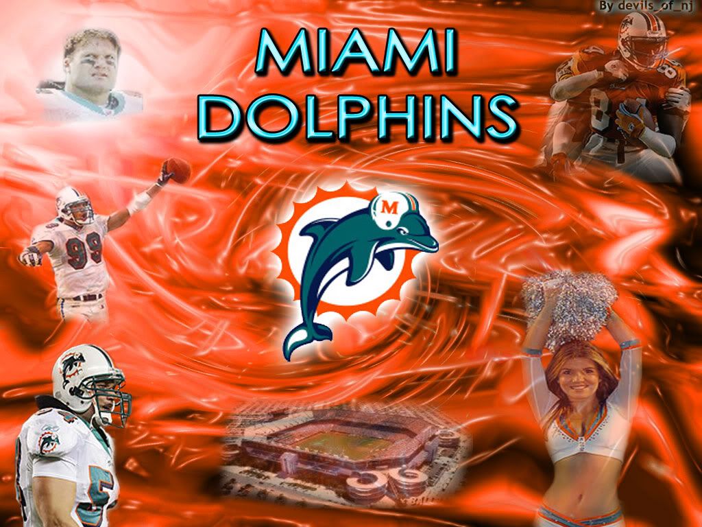
Miami Dolphins Wallpaper
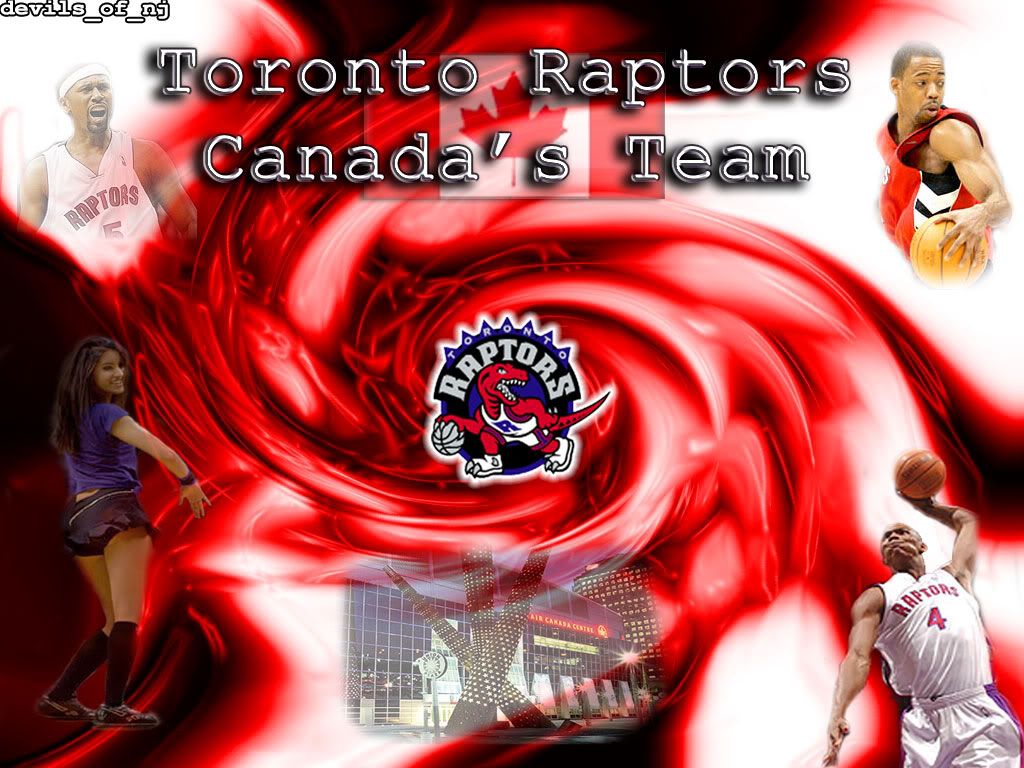
Tornoto Raptors Wallpaper
http://img.photobucket.com/albums/v606/ ... n93/ee.jpg
http://img.photobucket.com/albums/v606/ ... wall34.jpg
Blue Jays Wallpaper
Miami Dolphins Wallpaper
Tornoto Raptors Wallpaper
Sun Jun 26, 2005 6:34 am
can anybody got a 800x600 tmac wallpaper??
Sun Jun 26, 2005 6:50 am
I can make you one?
Tue Jun 28, 2005 5:54 am

Still working but here´s a preview.
Tue Jun 28, 2005 11:59 am
Nice wallpaper
I think the sig would look better with a border though...but thats just my opinion
I think the sig would look better with a border though...but thats just my opinion
Tue Jun 28, 2005 12:59 pm
Nice wallpaper, but I still think it'd look better if he was centered (since his body is symmetrical, it'd make sense if the entire composition was symmetrical) Assymmetry is good, but in this kind of composition, I'd stick with the figure centered.
Tue Jun 28, 2005 8:01 pm
ohh ill think about it but thankscyanide wrote:Nice wallpaper, but I still think it'd look better if he was centered (since his body is symmetrical, it'd make sense if the entire composition was symmetrical) Assymmetry is good, but in this kind of composition, I'd stick with the figure centered.
Wed Jun 29, 2005 4:25 pm
Hey,3th-cartoon,can you do a Steve Nash,Ben Wallace and Ray Allen wallpaper(together)