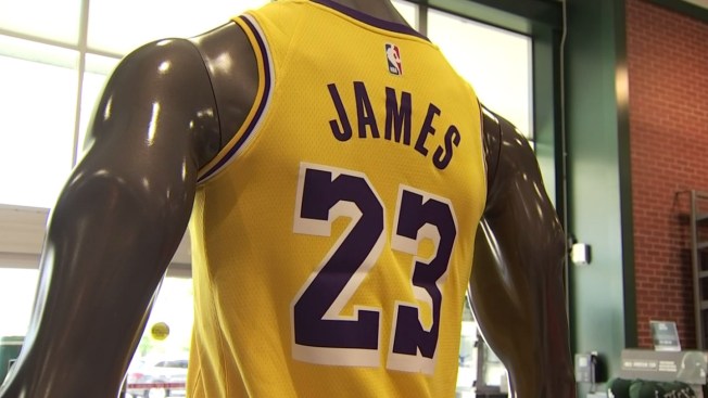
The shape of the collar and jersey in general returns to a more traditional basketball cut, with that the Lakers return to two colour striping around the sleeves and collar.
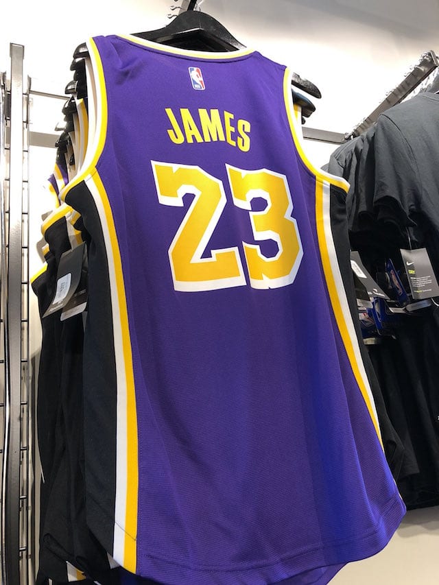
The stripes up the sides have been removed entirely on the golds and whites, again less clutter and much more clean; the purple uniform adds a black stripe up the side (why?!) flanked with two thin gold and white stripes.

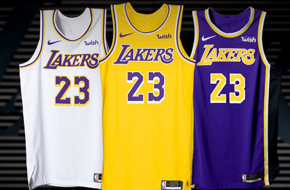
The retro-inspired look for the gold and white jerseys is fine, but the black looks really out of place on the purple jersey.


 What's the point of adding a black stripe on the side of the purple jerseys? I'd totally get it if it's gold with white outlines, and if the two other jerseys have the same elements on the side of their jerseys. It's like the designer left the layer of the stripes for the purple jerseys in Photoshop and forgot to remove it from the other jerseys.
 What's the point of adding a black stripe on the side of the purple jerseys? I'd totally get it if it's gold with white outlines, and if the two other jerseys have the same elements on the side of their jerseys. It's like the designer left the layer of the stripes for the purple jerseys in Photoshop and forgot to remove it from the other jerseys.


