
3PK[Durant wall] and Scoop's[Telfair sig] Amateur PS Gallery


![]() by Pera on Thu Jun 07, 2007 4:58 am
by Pera on Thu Jun 07, 2007 4:58 am

-

Pera - Posts: 1999
- Joined: Fri Jan 27, 2006 1:27 am
- Location: Slovenia
![]() by TomCat on Thu Jun 07, 2007 6:03 pm
by TomCat on Thu Jun 07, 2007 6:03 pm


Then I just did this for fun:

Thoughts?

2K10 Blazers Association | Photoshop Thread
Stan Smith "said", not wrote:Evening. Even-ing. Making things even.
-

TomCat - Providing quaility ____ since 1991
- Posts: 1193
- Joined: Sun Jan 21, 2007 12:42 pm
- Location: Victoria, Australia
![]() by 3PK on Thu Jun 07, 2007 6:38 pm
by 3PK on Thu Jun 07, 2007 6:38 pm
This was simple so i added a bit of flavour to the next one
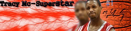
I made some small changes to this one and liked it way more just for some reason

This one i just added a border to top it off


-

3PK - Posts: 734
- Joined: Thu Apr 12, 2007 3:06 pm

![]() by TomCat on Sat Jun 09, 2007 10:53 am
by TomCat on Sat Jun 09, 2007 10:53 am

Thoughts?
2K10 Blazers Association | Photoshop Thread
Stan Smith "said", not wrote:Evening. Even-ing. Making things even.
-
TomCat - Providing quaility ____ since 1991
- Posts: 1193
- Joined: Sun Jan 21, 2007 12:42 pm
- Location: Victoria, Australia
![]() by 3PK on Sat Jun 09, 2007 11:39 am
by 3PK on Sat Jun 09, 2007 11:39 am
First of all i made a Shawn Marion Sig Experimenting with a Bit of text maybe not my best work though

Then i tried lots of different techniques with Brandon Roy

EDIT: i made a few changes to the roy sig just something different

Any Thoughts?
-
3PK - Posts: 734
- Joined: Thu Apr 12, 2007 3:06 pm
![]() by TomCat on Sat Jun 09, 2007 11:47 am
by TomCat on Sat Jun 09, 2007 11:47 am
Btw, I will beat you in the poll!
2K10 Blazers Association | Photoshop Thread
Stan Smith "said", not wrote:Evening. Even-ing. Making things even.
-
TomCat - Providing quaility ____ since 1991
- Posts: 1193
- Joined: Sun Jan 21, 2007 12:42 pm
- Location: Victoria, Australia
![]() by TomCat on Sat Jun 09, 2007 1:58 pm
by TomCat on Sat Jun 09, 2007 1:58 pm
2K10 Blazers Association | Photoshop Thread
Stan Smith "said", not wrote:Evening. Even-ing. Making things even.
-
TomCat - Providing quaility ____ since 1991
- Posts: 1193
- Joined: Sun Jan 21, 2007 12:42 pm
- Location: Victoria, Australia
![]() by 3PK on Sat Jun 09, 2007 2:03 pm
by 3PK on Sat Jun 09, 2007 2:03 pm
3PK, you really need to work on color. A basic sig using yellow, red and purple isn't usually gonna turn out well.
Yeh true but most good sigs i see don't have much colour so i dunno but yeh you are right, and i guess you voted for Scoop?
3PK, I think your sigs are too bright. Just my opinion.....
Fair enough i'll try something darker
Looks like i have to get some good sigs going to beat you scoop i will be back in an Hour with about five new sigs
IT'S ON
-
3PK - Posts: 734
- Joined: Thu Apr 12, 2007 3:06 pm
![]() by --- on Sat Jun 09, 2007 2:19 pm
by --- on Sat Jun 09, 2007 2:19 pm
i will be back in an Hour with about five new sigs
And that's exactly where your going wrong. Take time on your sigs until you get the outcome you want. If the outcome you want only takes 10-15 minutes, your not trying hard enough.
-

--- - Posts: 4553
- Joined: Tue Dec 20, 2005 3:04 pm
![]() by TomCat on Sat Jun 09, 2007 2:30 pm
by TomCat on Sat Jun 09, 2007 2:30 pm
Shannon wrote:i will be back in an Hour with about five new sigs
And that's exactly where your going wrong. Take time on your sigs until you get the outcome you want. If the outcome you want only takes 10-15 minutes, your not trying hard enough.
Very true. I haven't spent enough time on my sigs. I don't have enough patience to sit there for ages trying to perfect my work, but I should though.....
2K10 Blazers Association | Photoshop Thread
Stan Smith "said", not wrote:Evening. Even-ing. Making things even.
-
TomCat - Providing quaility ____ since 1991
- Posts: 1193
- Joined: Sun Jan 21, 2007 12:42 pm
- Location: Victoria, Australia
![]() by 3PK on Sat Jun 09, 2007 2:35 pm
by 3PK on Sat Jun 09, 2007 2:35 pm
Quote:
i will be back in an Hour with about five new sigs
And that's exactly where your going wrong. Take time on your sigs until you get the outcome you want. If the outcome you want only takes 10-15 minutes, your not trying hard enough.
That was only a Joke/Exaggeration although thats an wake up call i definately don't spend enough time and this time seriosuly in about an hour i will have 1/2 posts which are my best work....
By the way last night i made a few banners and didn't post them,
Well i started off doing a Few Mirror Players a few worked and a few didn't as well as this i also used a few effects
Here is my First One of Allen Iverson

Here is My Rashard Lewis sig

-
3PK - Posts: 734
- Joined: Thu Apr 12, 2007 3:06 pm
![]() by 3PK on Sat Jun 09, 2007 5:46 pm
by 3PK on Sat Jun 09, 2007 5:46 pm
In order of worst being 6. and best being 1.
6.

5.

4.

3.

2.

1.

-
3PK - Posts: 734
- Joined: Thu Apr 12, 2007 3:06 pm
![]() by --- on Sat Jun 09, 2007 6:36 pm
by --- on Sat Jun 09, 2007 6:36 pm
5) Looks like a Zebra dyed the hair on its back. The second picture of DWade.. well, I don't even know what it is. Text needs alot of work.
4) Repitition can be a good thing. Repeating text sometimes looks good, but not when places like that and when that big. I know some people won't agree, but repeating images IMO is a no-no, unless they are very faded and a different size - they should be part of the background.
3) Repitition at it's worst. Count them - 6 Gilbert's. Text is repititive like in your earlier sigs, same font, same effects. Background is shallow and doesn't fit. Bright red border doesn't work.
2) Color, color, color... Let's see which ones you used. Yellow, Green, Red and Blue.Clown colors essentially, all splattered on top of each other just doesn't work. Composition is better but the color destroyed that one. Check spelling: Wiazards
1) Too many effects. Coloring is even worse. Putting a red and black background is fine, but once you place a lime green border over the top, it kills it. Text is aweful, the "Falsh" text looks like water which is fine, but not on a red/green sig.
Note: "Brushing" is not what it sounds like. You don't literally 'brush' over the canvas. You get one brush, click to put it on one area, then get a new brush, put that somewhere, until you cover the area you need to. Literal 'brushing' on photoshop results in a background looking like it was made with the clone stamp tool.
-
--- - Posts: 4553
- Joined: Tue Dec 20, 2005 3:04 pm
![]() by 3PK on Sat Jun 09, 2007 8:40 pm
by 3PK on Sat Jun 09, 2007 8:40 pm
6) Looks like a 12 year old school girl made it. The stars, underlining of the word, colors, text.. not good.
5) Looks like a Zebra dyed the hair on its back. The second picture of DWade.. well, I don't even know what it is. Text needs alot of work.
4) Repitition can be a good thing. Repeating text sometimes looks good, but not when places like that and when that big. I know some people won't agree, but repeating images IMO is a no-no, unless they are very faded and a different size - they should be part of the background.
3) Repitition at it's worst. Count them - 6 Gilbert's. Text is repititive like in your earlier sigs, same font, same effects. Background is shallow and doesn't fit. Bright red border doesn't work.
2) Color, color, color... Let's see which ones you used. Yellow, Green, Red and Blue.Clown colors essentially, all splattered on top of each other just doesn't work. Composition is better but the color destroyed that one. Check spelling: Wiazards
1) Too many effects. Coloring is even worse. Putting a red and black background is fine, but once you place a lime green border over the top, it kills it. Text is aweful, the "Falsh" text looks like water which is fine, but not on a red/green sig.
Good to know i suck and personally i know you will think i am crazy but spending more time on them just made them worse and worse what did you think about the two sigs above them? I thought they were both better then the 6 horrible sigs i made
-
3PK - Posts: 734
- Joined: Thu Apr 12, 2007 3:06 pm
![]() by TomCat on Sun Jun 10, 2007 1:50 pm
by TomCat on Sun Jun 10, 2007 1:50 pm
2K10 Blazers Association | Photoshop Thread
Stan Smith "said", not wrote:Evening. Even-ing. Making things even.
-
TomCat - Providing quaility ____ since 1991
- Posts: 1193
- Joined: Sun Jan 21, 2007 12:42 pm
- Location: Victoria, Australia
![]() by TomCat on Sun Jun 10, 2007 2:55 pm
by TomCat on Sun Jun 10, 2007 2:55 pm

Thoughts?
2K10 Blazers Association | Photoshop Thread
Stan Smith "said", not wrote:Evening. Even-ing. Making things even.
-
TomCat - Providing quaility ____ since 1991
- Posts: 1193
- Joined: Sun Jan 21, 2007 12:42 pm
- Location: Victoria, Australia
![]() by Jugs on Sun Jun 10, 2007 9:26 pm
by Jugs on Sun Jun 10, 2007 9:26 pm
Scoop, you have to learn that Roy facing the left, does not go on the left, you cut his nose out of the sig
Like every beginner, your font sucks balls. and putting the Roy behind the Brushing sucks.
you also have to learn how to shade the picture with the colour theme. and to cut better.
Um, sorry about the wording, I have not used Photoshop in 8 months.
- Jugs
- Posts: 7442
- Joined: Wed Mar 16, 2005 9:32 pm
- Location: Geelong, Australia
![]() by 3PK on Mon Jun 11, 2007 4:33 pm
by 3PK on Mon Jun 11, 2007 4:33 pm
here's the first one i made

Here's the second one i made

Finally here's the third one

-
3PK - Posts: 734
- Joined: Thu Apr 12, 2007 3:06 pm
![]() by Gundy on Mon Jun 11, 2007 4:59 pm
by Gundy on Mon Jun 11, 2007 4:59 pm
-
Gundy - Posts: 1601
- Joined: Fri Aug 04, 2006 12:27 pm
- Location: Cincinnati, Ohio
Who is online
Users browsing this forum: No registered users and 1 guest