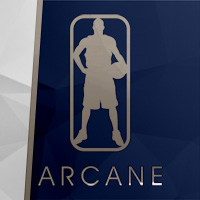
they replaced the purple with red, and changed the font of the wordmark, and changed the shape of the box around the wordmark....btw, this is the Draft Cap for em
Personally, i like it ok, the new wordmark is refreshing, but thats about it...IMO, they should have completely redesigned themselves...and also, the colors are a similar intensity, so from a Design standpoint, no heirarchy exists in respect to the colors, so that sux too...now i just await the unis
what u guys think of the change?
EDIT:

______________>> Click for Bigger Version <<