
The Denver Nuggets unveiled their new, kinda-retro logos late tonight both via an event and on their social media channels which they titled “Evolve”. The logos are very similar to what was first posted by Conrad Burry several weeks ago.
Using their secondary “pickaxe” logo as the main focus of the new identity the club stepped backwards and went with a colour scheme more reminiscent of those used during the 1990s and into the early 2000s adding a deep red to the scheme which instantly brings back memories of those old Nuggets teams.
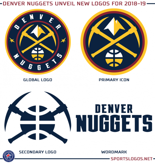
I wonder how long it'll be before every team in the league has a circular logo. It looks fine and all, but it feels like there's more creativity and originality in the secondary and alternate logos these days.
The new uniforms:
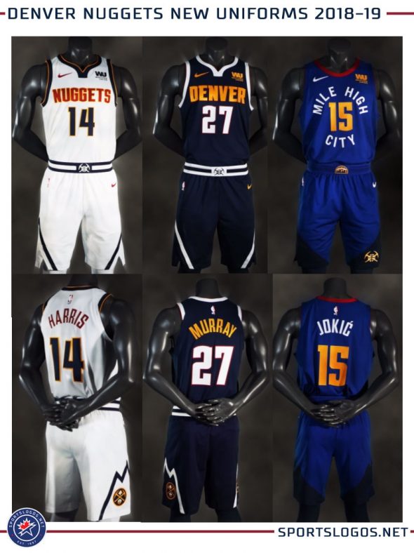
I like them. The colours feel like even more of a throwback to the designs from the mid to late 90s, which are probably my favourite Nuggets jerseys.


