
New logos, designs, etc.
Re: New logos, designs, etc.
![]() by buzzy on Fri Aug 01, 2014 5:47 am
by buzzy on Fri Aug 01, 2014 5:47 am
-

buzzy - Take it sleazy.

- Posts: 4033
- Joined: Sun Jul 03, 2005 11:19 pm
- Location: Vienna
Re: New logos, designs, etc.
![]() by Andrew on Fri Aug 01, 2014 9:28 am
by Andrew on Fri Aug 01, 2014 9:28 am
Contact: Email | X | Bluesky
Modding Topics: NBA 2K10 | NBA Live 08 | NBA Live 07 | NBA Live 06 | NBA 2K6 | NBA Live 2005 | NBA Live 2004 | NBA Live 96
Story Topics: NBA Live 16 | NBA 2K14 | NBA 2K13 | NBA Live 06 (Part 2) | NBA Live 06 (HOF) | NBA Live 2004 (HOF)
NLSC: Podcast | The Friday Five | Monday Tip-Off | Wayback Wednesday | Facebook | X | YouTube | Instagram | Bluesky
Donations/Support: Patreon | PayPal
-
Andrew - Retro Basketball Gamer

- Posts: 115384
- Joined: Thu Aug 22, 2002 8:51 pm
- Location: Australia
Re: New logos, designs, etc.
![]() by Murat on Fri Aug 01, 2014 4:41 pm
by Murat on Fri Aug 01, 2014 4:41 pm

- Murat
- The modder formerly known as Badger

- Posts: 6489
- Joined: Sun Feb 14, 2010 6:07 am
- Location: US/East Coast
Re: New logos, designs, etc.
![]() by Stress Fracture on Wed Aug 13, 2014 1:09 pm
by Stress Fracture on Wed Aug 13, 2014 1:09 pm

benji wrote:LeBron is such a choker. And people were talking about him as an all-time great. As having possibly surpassed Kobe. What a joke.
velvet bliss wrote:Andrew, you the real MVP.
Andrew wrote:He who flops and flails to the Finals and a title, flops and flails best.
- Stress Fracture
- Posts: 2949
- Joined: Wed Jan 02, 2008 1:03 pm
Re: New logos, designs, etc.
![]() by Andrew on Wed Aug 13, 2014 1:11 pm
by Andrew on Wed Aug 13, 2014 1:11 pm
Contact: Email | X | Bluesky
Modding Topics: NBA 2K10 | NBA Live 08 | NBA Live 07 | NBA Live 06 | NBA 2K6 | NBA Live 2005 | NBA Live 2004 | NBA Live 96
Story Topics: NBA Live 16 | NBA 2K14 | NBA 2K13 | NBA Live 06 (Part 2) | NBA Live 06 (HOF) | NBA Live 2004 (HOF)
NLSC: Podcast | The Friday Five | Monday Tip-Off | Wayback Wednesday | Facebook | X | YouTube | Instagram | Bluesky
Donations/Support: Patreon | PayPal
-
Andrew - Retro Basketball Gamer
- Posts: 115384
- Joined: Thu Aug 22, 2002 8:51 pm
- Location: Australia
Re: New logos, designs, etc.
![]() by [Q] on Wed Aug 13, 2014 3:41 pm
by [Q] on Wed Aug 13, 2014 3:41 pm

-
[Q] - NBA Live 18 Advocate
- Posts: 14396
- Joined: Tue Oct 01, 2002 8:20 am
- Location: Westside, the best side
Re: New logos, designs, etc.
![]() by Murat on Wed Aug 13, 2014 5:23 pm
by Murat on Wed Aug 13, 2014 5:23 pm
Their best design after Richmond-Webber era uniforms.
- Murat
- The modder formerly known as Badger
- Posts: 6489
- Joined: Sun Feb 14, 2010 6:07 am
- Location: US/East Coast
Re: New logos, designs, etc.
![]() by Ese on Thu Aug 14, 2014 2:30 pm
by Ese on Thu Aug 14, 2014 2:30 pm
-

Ese - Posts: 182
- Joined: Tue Nov 12, 2013 7:56 pm
- Location: Parts Unknown
Re: New logos, designs, etc.
![]() by Mad-Raiiden on Mon Aug 18, 2014 8:49 pm
by Mad-Raiiden on Mon Aug 18, 2014 8:49 pm
I love those Kings Jerseys
I'm the only one who think that those Christmas jerseys are even more ugly than last year ones?
-

Mad-Raiiden - Posts: 254
- Joined: Sun Oct 27, 2013 4:11 am
- Location: France
Re: New logos, designs, etc.
![]() by Murat on Wed Aug 20, 2014 7:13 pm
by Murat on Wed Aug 20, 2014 7:13 pm
- Murat
- The modder formerly known as Badger
- Posts: 6489
- Joined: Sun Feb 14, 2010 6:07 am
- Location: US/East Coast
- shadowgrin
- Doesn't negotiate with terrorists. NLSC's Jefferson Davis. The Questioneer
- Posts: 23229
- Joined: Thu Dec 12, 2002 6:21 am
- Location: In your mind
Re: New logos, designs, etc.
![]() by [Q] on Wed Sep 10, 2014 11:15 am
by [Q] on Wed Sep 10, 2014 11:15 am
http://grantland.com/features/nba-court ... r-rankings
Shows most teams have gone really conservative (and boring) with court designs. Dude who wrote it has bad taste and for some reason Hayes big logos at center court. He's also color blind based on his descriptions of the colors on the court.
Sad that Toronto got rid of the 3D sign under the basket
And what is up with this mystery pelicans court? Didn't see anything special in the Live 15 screenshot
-
[Q] - NBA Live 18 Advocate
- Posts: 14396
- Joined: Tue Oct 01, 2002 8:20 am
- Location: Westside, the best side
Re: New logos, designs, etc.
![]() by Murat on Fri Sep 12, 2014 11:14 pm
by Murat on Fri Sep 12, 2014 11:14 pm
And Houston, I’m afraid, has a history of beating you over the head with space-inspired court designs.
http://s701.photobucket.com/user/67turk ... 6.png.html is linked to that sentence. Yay!
Also retroman's Atlanta Hawks 97 court patch for 2K14 is linked too, on this sentence;
Perhaps that was a natural reaction to the red menace court of the early 2000s
dl_mod/thumbs/4714_1997-99%20The%20Omni%20%20in%20Atlanta.jpg
- Murat
- The modder formerly known as Badger
- Posts: 6489
- Joined: Sun Feb 14, 2010 6:07 am
- Location: US/East Coast
Re: New logos, designs, etc.
![]() by JaoSming on Sat Sep 13, 2014 12:47 am
by JaoSming on Sat Sep 13, 2014 12:47 am
Qballer wrote:For you patchers, (almost) all 30 court designs:
http://grantland.com/features/nba-court-design-power-rankings/
Shows most teams have gone really conservative (and boring) with court designs. Dude who wrote it has bad taste and for some reason Hayes big logos at center court. He's also color blind based on his descriptions of the colors on the court.
Sad that Toronto got rid of the 3D sign under the basket
And what is up with this mystery pelicans court? Didn't see anything special in the Live 15 screenshot
For the Hawks section they mention that red paint court from 10 years ago or so. They link to a thumb hosted on our servers from one of retroman's mods.
- JaoSming
- 2KTV Producer

- Posts: 29904
- Joined: Tue Sep 13, 2005 12:45 am
- Location: 2K

Re: New logos, designs, etc.
![]() by Andrew on Wed Sep 24, 2014 10:37 am
by Andrew on Wed Sep 24, 2014 10:37 am
Contact: Email | X | Bluesky
Modding Topics: NBA 2K10 | NBA Live 08 | NBA Live 07 | NBA Live 06 | NBA 2K6 | NBA Live 2005 | NBA Live 2004 | NBA Live 96
Story Topics: NBA Live 16 | NBA 2K14 | NBA 2K13 | NBA Live 06 (Part 2) | NBA Live 06 (HOF) | NBA Live 2004 (HOF)
NLSC: Podcast | The Friday Five | Monday Tip-Off | Wayback Wednesday | Facebook | X | YouTube | Instagram | Bluesky
Donations/Support: Patreon | PayPal
-
Andrew - Retro Basketball Gamer
- Posts: 115384
- Joined: Thu Aug 22, 2002 8:51 pm
- Location: Australia
Re: New logos, designs, etc.
![]() by [Q] on Wed Sep 24, 2014 3:20 pm
by [Q] on Wed Sep 24, 2014 3:20 pm
I can't believe Mark didn't pick my design:

-
[Q] - NBA Live 18 Advocate
- Posts: 14396
- Joined: Tue Oct 01, 2002 8:20 am
- Location: Westside, the best side
Re: New logos, designs, etc.
![]() by Andrew on Wed Sep 24, 2014 8:20 pm
by Andrew on Wed Sep 24, 2014 8:20 pm
Contact: Email | X | Bluesky
Modding Topics: NBA 2K10 | NBA Live 08 | NBA Live 07 | NBA Live 06 | NBA 2K6 | NBA Live 2005 | NBA Live 2004 | NBA Live 96
Story Topics: NBA Live 16 | NBA 2K14 | NBA 2K13 | NBA Live 06 (Part 2) | NBA Live 06 (HOF) | NBA Live 2004 (HOF)
NLSC: Podcast | The Friday Five | Monday Tip-Off | Wayback Wednesday | Facebook | X | YouTube | Instagram | Bluesky
Donations/Support: Patreon | PayPal
-
Andrew - Retro Basketball Gamer
- Posts: 115384
- Joined: Thu Aug 22, 2002 8:51 pm
- Location: Australia
Re: New logos, designs, etc.
![]() by Kevin on Wed Sep 24, 2014 10:40 pm
by Kevin on Wed Sep 24, 2014 10:40 pm
-
Kevin - Fuck the Celtics
- Posts: 8038
- Joined: Sat Nov 16, 2013 9:47 pm
- Location: Staples
Re: New logos, designs, etc.
![]() by Moz on Wed Sep 24, 2014 11:22 pm
by Moz on Wed Sep 24, 2014 11:22 pm

Nationwide is on your side...
-
Moz - What a load of bollocks...
- Posts: 1332
- Joined: Wed Mar 07, 2007 8:00 pm
- Location: Superunknown
Re: New logos, designs, etc.
![]() by deihatein on Thu Sep 25, 2014 12:11 am
by deihatein on Thu Sep 25, 2014 12:11 am
shadowgrin wrote:Quick question: who is better in basketball, a black dude or a pinoy dude. If you thought or considered for a moment that it's the black dude then you're also a little bit racist.
End of any racist discussion.
Pinoy > Dallas Mavericks
-
deihatein - Like he never left!
- Posts: 3879
- Joined: Fri Jan 26, 2007 9:13 pm
- Location: Pilipphines
Re: New logos, designs, etc.
![]() by [Q] on Thu Sep 25, 2014 3:06 pm
by [Q] on Thu Sep 25, 2014 3:06 pm
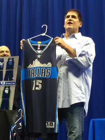
deihatein wrote:that new dallas alternate sucks balls
Pretty sure that's not an alternate. They're replacing all of their jerseys. At least when Mark Cuban started the contest, that's what he made it seem like was going to happen
-
[Q] - NBA Live 18 Advocate
- Posts: 14396
- Joined: Tue Oct 01, 2002 8:20 am
- Location: Westside, the best side
Re: New logos, designs, etc.
![]() by deihatein on Thu Sep 25, 2014 11:15 pm
by deihatein on Thu Sep 25, 2014 11:15 pm
Qballer wrote:deihatein wrote:that new dallas alternate sucks balls
Pretty sure that's not an alternate. They're replacing all of their jerseys. At least when Mark Cuban started the contest, that's what he made it seem like was going to happen
i think when cuban started the contest it was only for the alternate jerseys. if they are replacing the jersey it won't be that one that's for sure.
shadowgrin wrote:Quick question: who is better in basketball, a black dude or a pinoy dude. If you thought or considered for a moment that it's the black dude then you're also a little bit racist.
End of any racist discussion.
Pinoy > Dallas Mavericks
-
deihatein - Like he never left!
- Posts: 3879
- Joined: Fri Jan 26, 2007 9:13 pm
- Location: Pilipphines
Re: New logos, designs, etc.
![]() by koberulz on Fri Sep 26, 2014 12:33 am
by koberulz on Fri Sep 26, 2014 12:33 am


-

koberulz - Everything I say is false.
- Posts: 4636
- Joined: Sat Jun 04, 2005 11:46 pm
- Location: Perth, Australia
Re: New logos, designs, etc.
![]() by deihatein on Fri Sep 26, 2014 1:29 am
by deihatein on Fri Sep 26, 2014 1:29 am
From SB Nation:
This is what the Dallas Mavericks' new alternate uniforms will like starting in 2015-16. The blue ones will worn for eight games that year, according to Mavericks owner Mark Cuban. Dallas will then have the option to also use the white and/or green ones should they see fit.
For now, the Mavericks are expected to keep their regular uniforms, though there's a chance they too change in the future.
still i wouldn't be surprised if they do change the uniforms
shadowgrin wrote:Quick question: who is better in basketball, a black dude or a pinoy dude. If you thought or considered for a moment that it's the black dude then you're also a little bit racist.
End of any racist discussion.
Pinoy > Dallas Mavericks
-
deihatein - Like he never left!
- Posts: 3879
- Joined: Fri Jan 26, 2007 9:13 pm
- Location: Pilipphines
Who is online
Users browsing this forum: No registered users and 10 guests