Sat May 20, 2006 10:11 am
I dont care much for the Chicago one myself. That large bull is obnoxious, IMO. Additionaly, I dont think it will work very well with numbers on it.
Sat May 20, 2006 10:46 am
good point, yah i was just experimenting
Sat May 20, 2006 10:50 am
the celtics one is great. the rest.. ...
just stick with the celtics style
just stick with the celtics style
Sat May 20, 2006 10:58 am
Yeah, the Celtics is  .
.
Sat May 20, 2006 11:25 am
Celtics= good.
Bobcats= good job, but I don't like it.
Others= um.....

Bobcats= good job, but I don't like it.
Others= um.....
Sat May 20, 2006 12:32 pm
haha thx, ok well fot tonight i'll try making 3 more, and another thing, i tryed making the jersey to put up a game preview, did everythign exatcly to teh tutorial and also i made the prewvies and i did everything, got it in the game, and it's there says 1974-76 but it's locked??? So what'd i do wrong, i hada few ideas, the tutorial is for nbalive 05, but it's teh only one out there and 2) For dbf editting i didn't put True at the end, i left it blank, like the utorial said, but that might have somethign to do with, if anyone knows what it is plz inform me? THX
Sat May 20, 2006 1:38 pm
RSox wrote:Cavs jersey is kinda hard to see the workmark
yeah change the color of the wordmark
Sat May 20, 2006 1:49 pm
done and done, yah i did everythign like i was supposed, not a single mistake, ntta, it took 45 minutes or an hour including everything, but still syas LOCKED on teh jersey, i'll keep tryign, but i dunno
Sun May 21, 2006 9:40 am
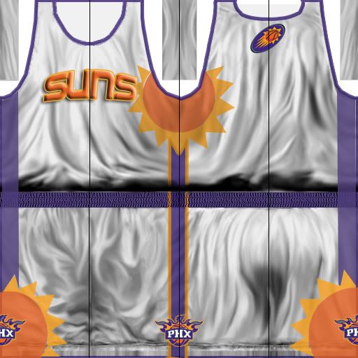
I've decided to make more realistic jerseys or altealst soem jerseys that are IN these days, say hello to timberwolves and phoenix:
t wolves:

suns:
t wolves:
suns:
Sun May 21, 2006 9:42 am
the suns one is pretty good
i dont really like the minnesota one though
i dont really like the minnesota one though
Sun May 21, 2006 10:01 am
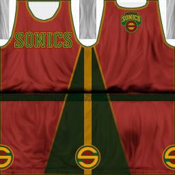
and now, sonics, old school mixes with new sonics.....
Sun May 21, 2006 10:24 am
Sonics is good except the logos ob the far right and left arn't going to look good in game
try to fix them
try to fix them
Sun May 21, 2006 10:55 am
Sun May 21, 2006 10:57 am
ok, so overall compared to my first jerseys are they gettign better or am i just wastign my time haha?
Sun May 21, 2006 10:57 am
shit i left the mid lines on suns, i gotta stop doin that
Sun May 21, 2006 1:16 pm
A dark blue pistons, with abit of new and old logos
Pistons:

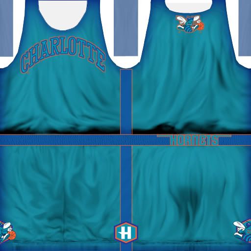
and charlotte hornets, better team then the bobcats too bad they left charlotte , anywya the jersey, charlotte hornets:
Pistons:
and charlotte hornets, better team then the bobcats too bad they left charlotte
Sun May 21, 2006 1:17 pm
would pinstripes look good on charlotte?
Sun May 21, 2006 1:17 pm
the charlotte one is good, the pistons one.. eh....
Sun May 21, 2006 1:29 pm
release the suns
Sun May 21, 2006 2:29 pm
ahah sorry man i wish i could, like i said i'll finish making all previews and then if i can figure out how to add jerseys to teh game, until then if any wants to make a jersey plz go ahead
Mon May 22, 2006 3:50 am
These are a lot better. The logos on the back need to be smaller, though, about half that size. 
Mon May 22, 2006 5:57 am
ok will do thanks
Mon May 22, 2006 6:27 am
ok this will be considered as the MEMPHIS GRIZZLIES jersey, how ever it is a classic of teh VANCOUVER GRIZZLIES, and it's fictional, here:
Memphis (vancover) grizzlies fictional:
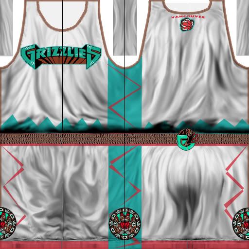
Memphis (vancover) grizzlies fictional:
Mon May 22, 2006 7:19 am
The back logo's still too big, and you left the mid-points visible again. I like it, though. Are you purposely only putting trim on one side of the jersey?